How do you know whether your content game is getting better or worse? It’s easy to rely on stock analytics tools, and for the beginning content marketer, tools such as Google Analytics are more than enough. For the veteran marketer who is creating content, how can we know with greater precision whether our content is getting better or worse? How can we more quickly diagnose the bad, double down on the good, and make our program sing?
In part 4 in this series, we look at the mathematical gulf separating our best content from our worst, and what that gulf means. If you haven’t read and done the exercises in part 1, part 2, and part 3, go back and do those first.
The difference between the best and worst performing content is the difference between the boundaries of the upper and lower quartiles. This is called the interquartile range, the IQR. The IQR (which we’re finally getting to in part 4 of the series) is a way to mathematically express how far apart our best and worst are. If the IQR were very tiny, it would mean very little variation between our best and worst content. If the IQR were gigantic, it would mean extreme variation between our hits and misses.
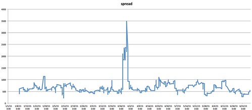
Let’s look at the IQR in our sample spreadsheet. What do we see?
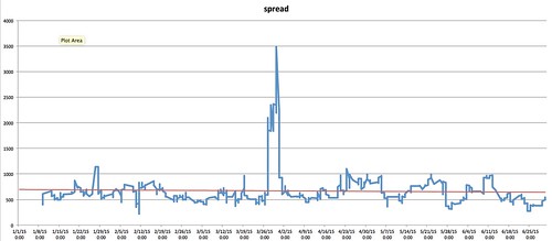
We see that except for a significant anomaly in the middle of the chart, the IQR otherwise appears relatively constant. Let’s add a trendline:
We see the trendline remaining flat as well. A flat trendline indicates our content popularity isn’t increasing or decreasing.
What does this tell us? The IQR helps us to understand our relative content popularity. An increasing spread means the popularity of our good and bad content has diverged. Something’s changed which has changed how people perceive our content. A decreasing spread means our content is becoming more homogenous. The difference between a great post and a bad post, in terms of popularity, is shrinking.
The IQR lacks context, however. For that, we’ll need to refer to the previous chart:
The spread/IQR tells us how fast things are diverging (in examples 1, 4, and 7) or converging (in examples 3, 6, and 9).
If both your great stuff quartile and your bad stuff quartile are ascending (see the previous post and examples 1, 2, and 3 above), then a converging IQR may not necessarily be a bad thing. The rising tide of popularity will lift all content.
If your great stuff and bad stuff quartiles are both descending (examples 7, 8, and 9 above), a converging IQR is really bad. Everything is losing ground, and you need to pivot immediately.
This concludes our in-depth look at interquartile ranges and how to use them to measure your content marketing. Try these techniques out. You don’t need to do them more than once a month, but you should test to determine how well your content is doing, using any relevant content marketing metric.
You might also enjoy:
- Mind Readings: Most Analytics Data is Wasted
- Almost Timely News, February 4, 2024: What AI Has Made Scarce
- Almost Timely News, January 14, 2024: The Future of Generative AI is Open
- You Ask, I Answer: AI Music Collaborations and Copyright?
- Almost Timely News, January 7, 2024: Should You Buy a Custom GPT?
Want to read more like this from Christopher Penn? Get updates here:
 Take my Generative AI for Marketers course! |


Leave a Reply