When it comes to processing and handling data, there are so many different ways to look at it in order to gain insight. The entire profession of statistical analysis does this on a regular basis. However, as with many things in marketing, understanding the basics and being able to do a few things well will get the job done most of the time. Today, let’s look at 5 different ways you can look at a pile of data in order to make sense of it, 5 questions you can ask of your data for more insight.
If you’d like to play along, you can use this Google Doc with data from my newsletter.
Question 1: Can it be grouped?
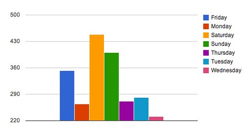
When you’re faced with a pile of data, clustering it together in logical groupings can sometimes be helpful for generating insight. In tab 2 in the example spreadsheet, I appended the day of the week for each statistic and then created a PivotTable. We see the results very clearly as to the day of the week that most people subscribe to the newsletter.
The logical insight is that if people are already subscribing in quantity on Saturdays, maybe run a promotion to encourage even more. Go with the flow!
Question 2: Can it be split?
If your data isn’t yielding any obvious answers at first glance, perhaps it can be split up and made more granular. This may be an issue of collection or of processing. Since the data I’ve got is already about as granular as the tools permit, we won’t have anything to do with the example. However, if we were looking at monthly data and there were no obvious insights, we could inquire about getting weekly or daily views.
Question 3: Can it be converted to rates?
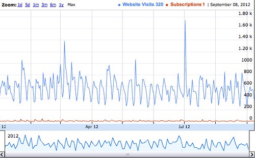
Rates can show trends that absolute data obscures, especially when you chart it out. For example, here’s what the data looks like in absolute form of website visits to subscriptions.
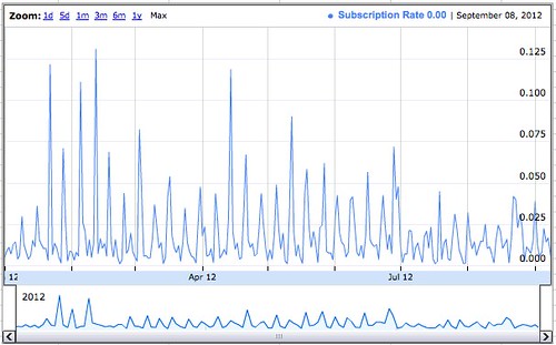
I don’t know about you, but that’s not super helpful to me. What if (as seen in the example sheet on the fourth tab) we added a rate and charted that instead?
That’s more helpful. We can see the rate of subscriptions a lot more clearly than in the first chart. To add some more depth to this, go check out how to add in moving averages.
Question 4: Can it be charted?
As you’ve seen in the past few examples, nothing is quite as impactful in statistical analysis as charting, as drawing a picture. Most people simply can’t visualize data in their heads without assistance, so rather than make them work, provide them the charts to do it. Charting out your data will also often point out either bad data (because the chart looks crazy bad in spots) or illogical groupings of data that result in a chart that looks like a crack addict got hold of an Etch a Sketch.
Question 5: Is it related?
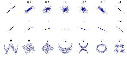
This is one of the most powerful and one of the most misunderstood questions in all of statistics. Given two sets of data, are they related? If so, what is the strength and nature of that relationship?
Being able to do a correlation between two sets of data is statistics 101, but it’s something that eludes most people. Spreadsheets have a correlation function built in. All you need to do is give it the two sets of data and then interpret the result. In tab 5, you’ll see a basic correlation between website visits and email subscriptions. The result, a -0.189 correlation, indicates that there’s no relationship between website visits and email subscriptions.

Examples of correlation
This is the time and place to say that correlation does not indicate causation – just because something is related doesn’t mean one causes the other. You have to do further research to answer that questions. That said, if a correlation doesn’t exist, then a causation by default does not exist. My next question that I’d want to research is – if website visits don’t drive subscriptions, then what does? That would be my next research step.
Conclusion
Take these 5 questions to any marketing data you’ve got and see if it helps you to start getting insights from your data and asking better questions about it.
You might also enjoy:
- You Ask, I Answer: Legality of Works in Custom GPTs?
- Almost Timely News, February 4, 2024: What AI Has Made Scarce
- You Ask, I Answer: Reliability of LLMs vs Other Software?
- You Ask, I Answer: AI Music Collaborations and Copyright?
- Mind Readings: Hacking Social Media Algorithms
Want to read more like this from Christopher Penn? Get updates here:
 Take my Generative AI for Marketers course! |


Leave a Reply