In the past week, I’ve been testing out Facebook’s pre-filled registration form plugin, which lets users who are logged into Facebook have their data conveniently pre-filled for them. After all, the less people have to type in, the better, right?
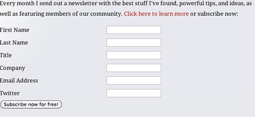
Here’s an example of the old signup form and popup:
Pretty bland, but straightforward.
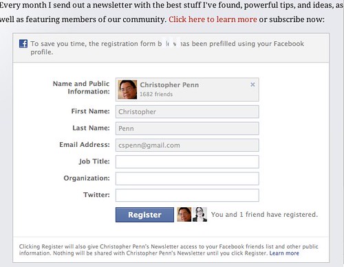
Here’s an example of the Facebook-based one:
Much sexier. The copy is still the same, explaining the benefits, but you get the Facebook look and feel, as well as some social proof and much less to type in. Note that I’ve used the same code in both the site signup form and popup.
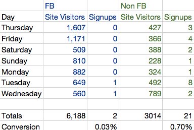
I predicted significantly more conversion from the Facebook-based form and popup for my newsletter. After all, it has social proof, it has convenience, it has a nicer look and feel. Let’s see side by side how the pop-up and regular form did on a week over week basis.
Well then. For my site, for my audience, for this period of time, Facebook’s pre-filled registration form and popup performed 21 times more poorly than a regular, boring, plain popup and form. This stunned me. Even though the past week had double the site visitors and more attention than most weeks on the blog, this result is fairly shocking.
Is it because it feels invasive? Is it because Facebook didn’t respond in a timely manner to a Javascript API call? I’m not sure. I tested the form mechanism repeatedly when I set it up and the system accepted the data and passed it all the way through to my CRM, so I know it wasn’t a technical glitch on my part. Without additional testing, I probably won’t know why this failed so badly, but I’m not going to test any more for right now, as these results are fairly conclusive for me. Farewell, Facebook-based popup and newsletter signup form.
The moral of the story? Always be testing. Just because it’s on the front page of Mashable or Techcrunch doesn’t mean it’ll do you a bit of good, no matter what your social media expert friends say.
As an aside, this is one of the reasons why you should encourage your employees to maintain personal sites, blogs, social media accounts, etc. If I had done this on Blue Sky Factory’s corporate website and reduced inbound lead generation by 2,100% in a week, I’d be looking for a new job. Instead, I just have fewer subscribers on my personal list, and with luck, they’ll come back when I write another useful blog post and I’ll catch them then, and the company incurs no substantial harm.
How has Facebook pre-filled registration form stuff been working for you? Similar results? Dissimilar results?
You might also enjoy:
- Mind Readings: Most Analytics Data is Wasted
- Mind Readings: What Makes A Good Conference/Event?
- Mind Readings: You Need Passwords for Life in the Age of Generative AI Fraud
- Almost Timely News, Febuary 18, 2024: From Comment to Content
- Almost Timely News, January 14, 2024: The Future of Generative AI is Open
Want to read more like this from Christopher Penn? Get updates here:
 Take my Generative AI for Marketers course! |


Leave a Reply